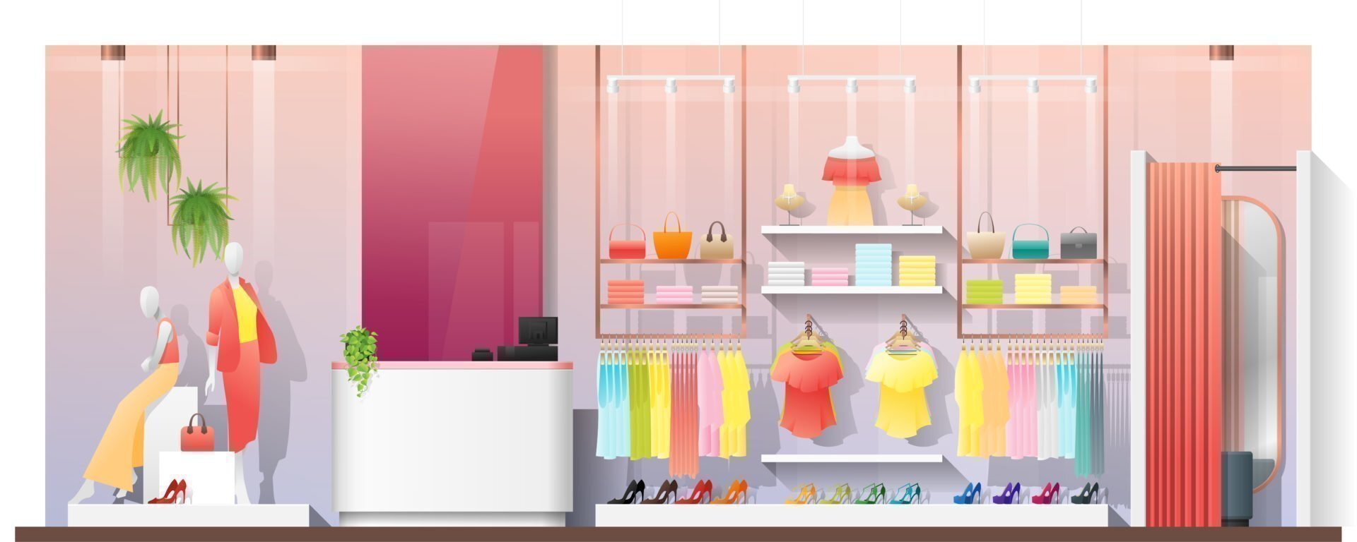
Imagine you’ve got a physical store. Now imagine you don’t have the tools or the strategy in place to present any structure or implement any visual merchandising so everything is essentially just thrown wherever it lands. It’s the king of all jumble sales.
This would never happen in a physical store. Millions of pounds are spent carefully planning not just the journey the customer takes through the store using display furniture, but positioning the right product in the right places throughout their journey. This is essential to the success of a stores sales and is the absolute same is true when it comes to online visual merchandising. If careful planning isn’t put into the journey your customer takes once they land on your site, your sales are certain to suffer.
Search
When a user lands on your site, the first areas they’re likely to turn to are your navigation and search. These are your high ‘footfall’ areas, so it makes sense to highlight products of interest here, as you would in-store.
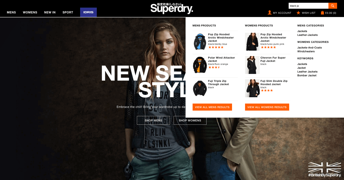
More and more users are turning straight to search as soon as they arrive on your site. It’s logical to help them with their search by offering suggestions predicted by the terms they begin to enter.
Superdry provide a great mix of imagery and information to help guide their customers to the products most likely to trigger a conversion. As soon as a user begins to enter a term, Superdry looks against its top selling products and top users searches to match the most appropriate suggestions. Highlighting key best-selling lines relating to the search is an excellent way to guide more customers towards a purchase.
Also, be sure to cover off what happens when a search goes wrong. What if the user types in a term that doesn’t return any results? Adding recommendations to your zero search results page can help to keep customers engaged and active on your site in the event that their search returns no results. In a store environment you’d never dream of turning a customer away without offering an alternative product first, so why do it online? It’s better to show something than nothing, both in terms of sales opportunities and good customer service.
Navigation
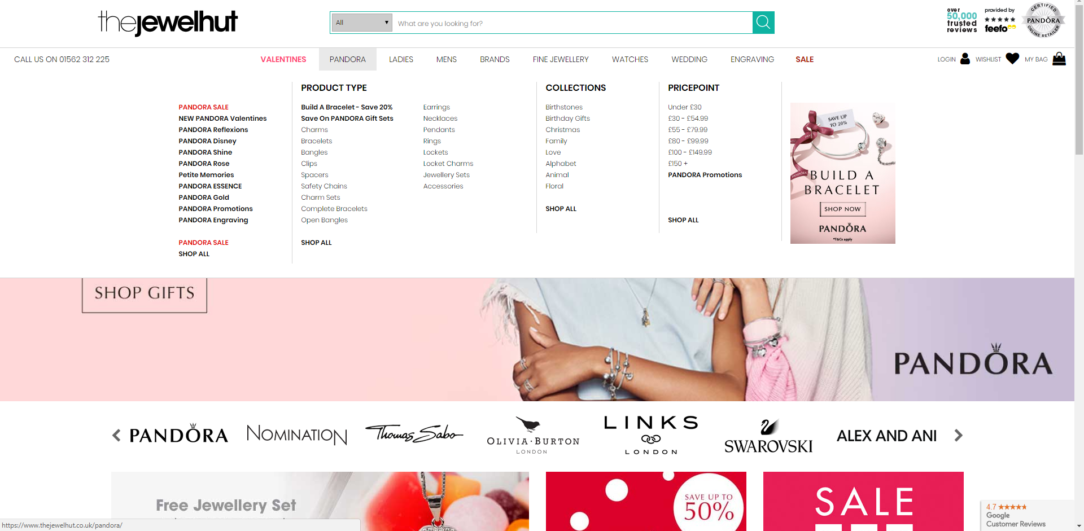
Think of the footfall that your navigation must receive each day, thousands of visitors will browse this area, but so many retailers aren’t bothering to utilise it. This is another great way to guide your customers to the categories or products which highly convert.
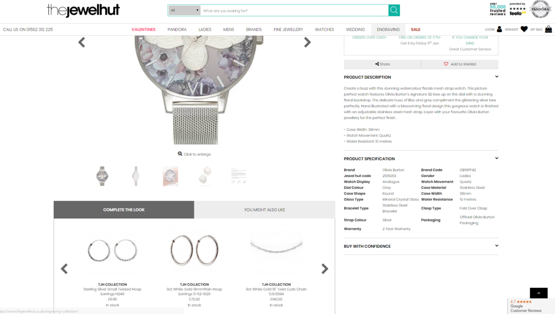
Category Pages
Once your customer is browsing category pages, it’s important to make sure the most commercial products are immediately within their eye-line. While prioritising best-sellers is often the first port of call, have you made sure you’ve considered the other specific factors which make your products commercial? This should be tailored to suit your users and focus on the things that they find important. Can the newest trend driven items be easily found? Are the products which users have highly rated at the top of the page? Failing to put the best products in front of your customer at all times will let you down quickly.
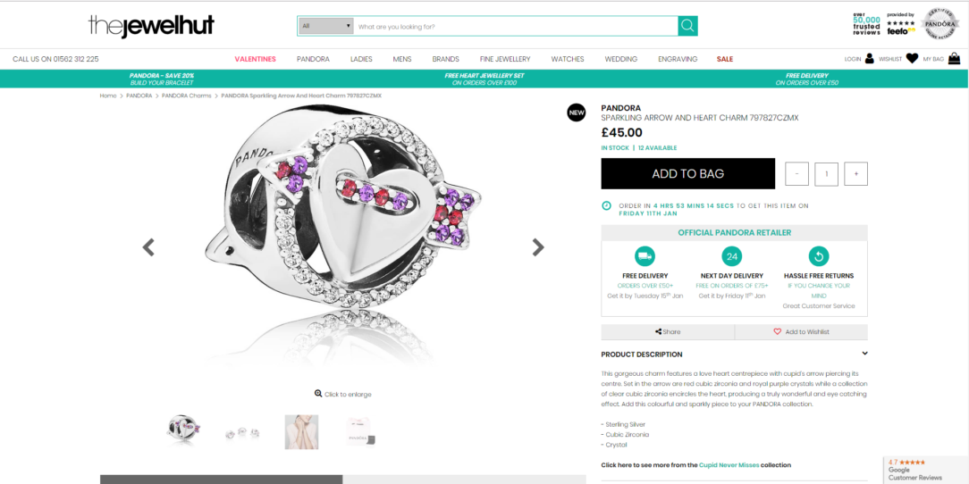
Ensuring that product imagery is strong and consistent is also integral to attracting sales. Without quality imagery, customers are unable to see the key details and information they need in order to make a purchase. Would you buy a product online if you didn’t have an image to look at?
No, most probably not.
You have to remember that your online customers either can’t or don’t want to set foot in your physical store, and if you’re a purely online retailer then that’s not even an option. You must give your customer all the information they need to be able to investigate and purchase a product that they can’t physically touch.
Have you included a scale shot, an internal shot, a shot of accessories, multiple angle, 360 view? All these shots help provide essential information that leads to a purchase. The quality of the imagery is also incredibly important. High quality imagery makes your products look higher quality, which is never a bad thing.
Product recommendations
Product recommendations are a great way to cross sell and up sell across your site. To ensure they are effective, it’s important to keep recommended products in context according to the customer buying cycle. What products are relevant at each key stage in the customer journey?
We’ve all experienced badly recommended products at some point while we’ve shopped online. Items that bear no connection to the products we’re viewing or purchasing. When product suggestions are planned poorly, they will convert poorly too. So should you recommend similar or complimentary items? Unfortunately, there’s not a one-size-fits-all approach which works across the board. The type of products you should recommend will depend on the type of products you sell, and your customers buying behaviour.
When product suggestions are planned poorly, they will convert poorly too.
A/B Testing
The best way to ensure that your chosen visual merchandising strategy is helping to increase your conversion is to continually A/B test. Make sure that your logic is based on real customer insight and user feedback so you can develop a strong hypothesis for testing across category page visual merchandising, product recommendations and search. It’s important to underpin exactly which change caused the test to succeed or fail. What did your customer react well to? What did they not react well to? These findings should then influence future testing strategies to ensure that your online conversion continues to grow.