
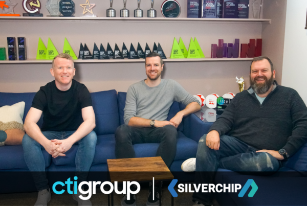
CTI appoints Chris Woodward as CEO
Chris joins CTI from Oliver Agency where he most recently held the position of UK…
Read More
By Tom Ashworth / On August 9, 2023 / In Hosting
Most organisations are aware of Cloudflare and the core benefits of the platform, such as the Web Application Firewall and Content Delivery Network, which both protect your application from DDOS…
 Posted by Tom Ashworth
By Dani Duxbury / On November 11, 2021 / In News, Nublue Blog, Uncategorized
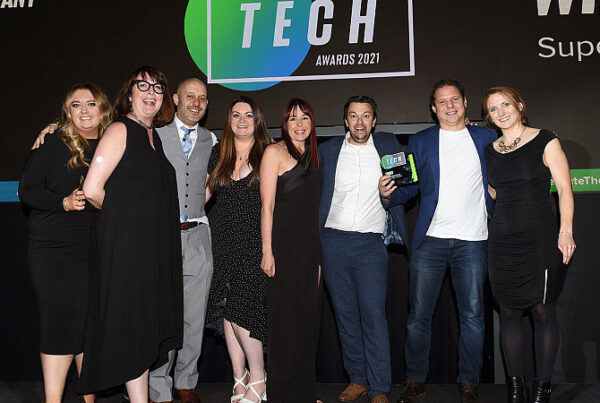
Nublue has been named Tech Team of the Year at The Prolific North Tech Awards 2021. The awards celebrate the incredible innovation of the North’s tech sector – rewarding the…
 Posted by Dani Duxbury